
Je kan een andere smaak hebben dan een ander, over smaak valt nu eenmaal niet te twisten. Als iedereen dezelfde zou hebben dan was het een simpele kwestie op deze wereld. Zo ook bij de PlayStation 3, houden mensen wel van het huidige design? De fashion/tech fans die we vonden op de website van Tranism hebben een heel andere voorkeur voor hun toekomstige PlayStation 3. Een wat mooier professioneler design. Op zich niet slecht al zeg ik het zelf.
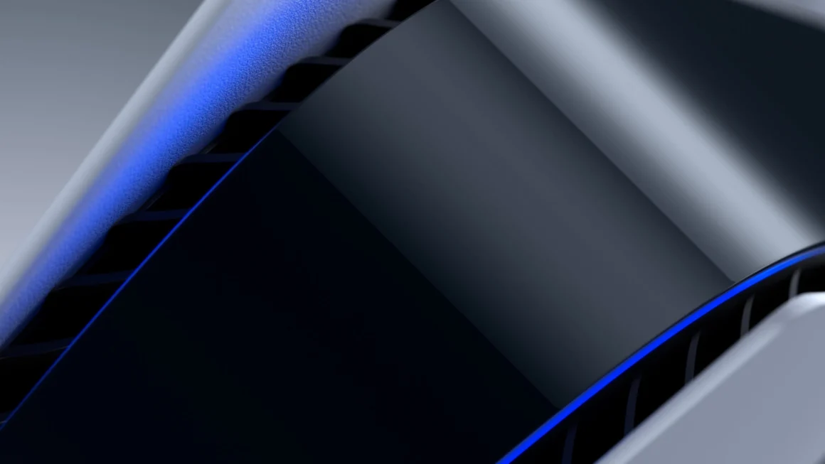
I much prefer the design concept by industrial designer Jaren Goh. His iteration of the PS3 is slick, seems balanced, and takes that age old design philosophy that less is always more. The actual acronymic Playstation logo highlighted by version number, to me is more powerful and memorable than writing it across the machine. In a way, its iconic because we see that logo everywhere and yet Sony decided to go and change it. Right now, its just three characters and the number “3” allows for both perfectly symmetry and/or asymmetry depending on where it’s placed. I also like how Goh’s design in the disc drive keep the exterior lines of the unit clean. It also has height, and seems to tower when placed vertically, and that smooth curve from body to foot stand is just beautiful. The mesh grill that all of the next generation game consoles have has a chrome plate on it, making it a part of the design as opposed to an afterthought of where to drill the holes.